fbpx
Franco’s Ices
06/08/15

Franco’s Ices

[rev_slider_vc alias=”francosices”]
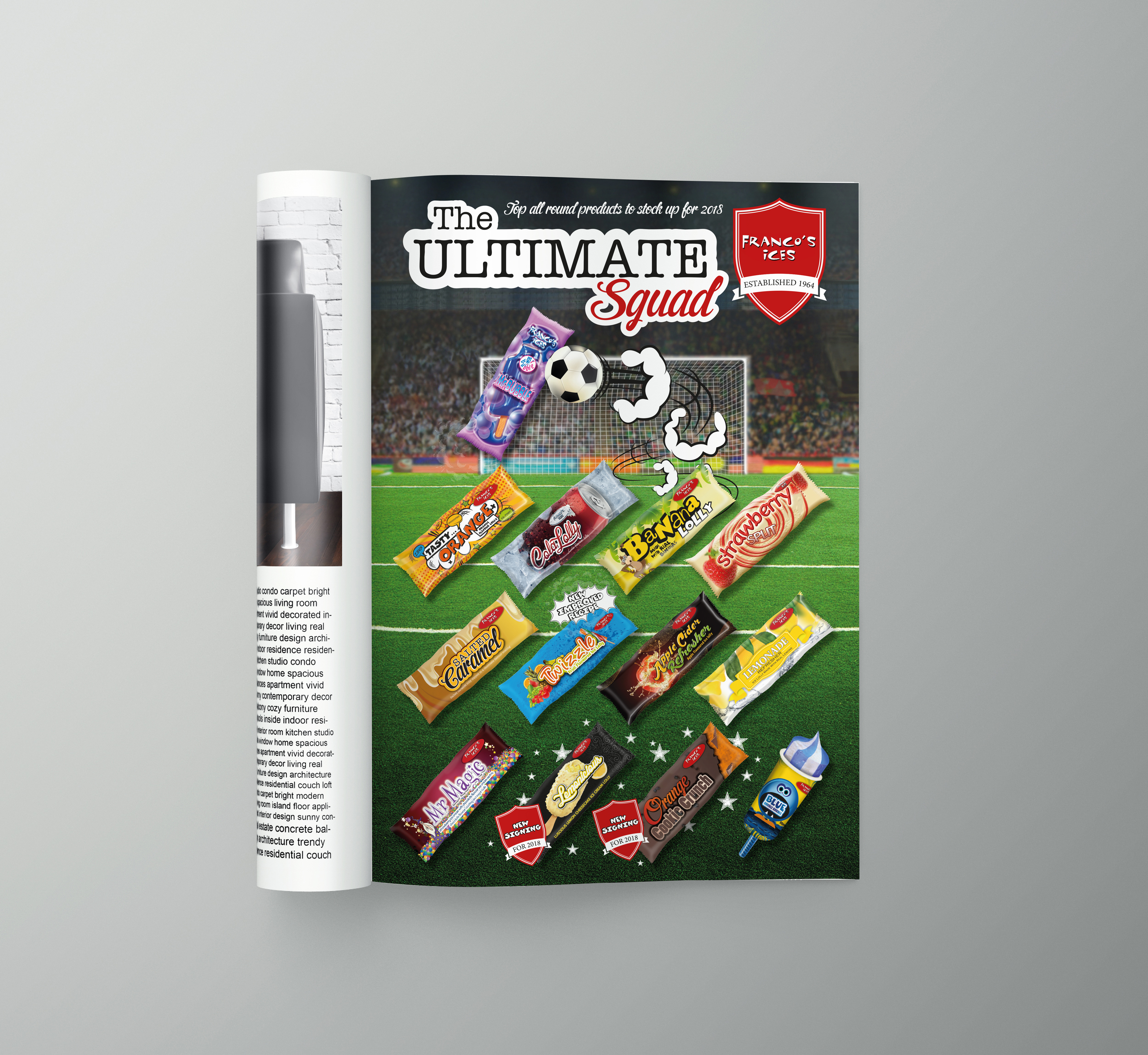
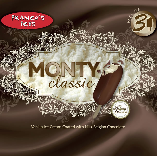
FRANCO’S ICES

We were so pleased when we began working with Franco’s Ices as each design is a joy to produce!!

Franco’s Ices (est. 1964), a true family run business that manufacture and distribute nationally their widely loved brand of ice creams and ice lollies.

Each design is carefully researched and the old brain cells get to work coming up with new, fresh ideas that will reflect the product and appeal to the target market. Using our creative flair we have produced boxes and individual wrapper designs for both new and existing products.

Magazine adverts have also been created to promote a variety of products and our latest project is the new website design http://www.francos-ices.co.uk

no responses
Parklands Health and Fitness Club
06/08/15

Parklands Health and Fitness Club

[rev_slider_vc alias=”parklands”]

PARKLANDS HEALTH AND FITNESS CLUB AT RINGWOOD HALL HOTEL

The leisure facilities at Ringwood Hall were to be refurbished, the general feeling was that the leisure facilities should be a stand-alone brand, away from the hotel.

The fitness club is a member only club set in the beautiful grounds of the hotel whilst separate from the main hotel building. Our vision was to emphasise the surroundings within the new brand identity.

The new Parklands logo features the single leaf symbolising the well-known Ringwood Park. The colours for the new interior were to be olive green and grey so we used these as key colours within the literature and the logo was kept vibrant, using rustic oranges and deep reds to compliment the interior colours.

Individual icons were developed to show the main features of the fitness club. These feature throughout the literature for Parklands giving easy reference at a glance to facilities on offer.

Parklands Health and Fitness Club - Leaflets
no responses
Ringwood Hall Hotel
06/08/15

Ringwood Hall Hotel

[rev_slider_vc alias=”ringwoodhallhotel”]

RINGWOOD HALL HOTEL

The Beautiful Grade II listed building set amongst stunning grounds provides an amazing focal point throughout our designs for this amazing hotel! We have worked closely with Ringwood Hall for numerous years producing their wedding literature, Christmas and events brochures along with their corporate e-brochure, menu’s, banners, stationery, labels and adverts.

As the hotel has changed over the years their style and brand has grown with it. Recently the wedding brochure was adapted to be image focused with full page displays. Captions are subtly placed to work around the imagery, emphasising the warmth and atmosphere this stunning hotel offers.

Christmas is a magical time at Ringwood Hall and their new style of Christmas brochure portrays just that, a fun yet informative brochure so information is there on hand to business looking for somewhere to host their annual party and individuals looking for a treat or an escape!

Ringwood Hall Hotel - Folder
Ringwood Hall Hotel - Chutney
Ringwood Hall Hotel - Ipad
no responses
Polar  Windows
06/08/15

Polar Windows

[rev_slider_vc alias=”polarwindows”]

POLAR WINDOWS

A re-fresh of a well-known brand was required for Polar.

They felt their logo needed updating but didn’t want it to be unrecognisable as their consistent advertising had developed them into a well know, recognisable name. We dissected their existing brand and gave a modern twist to the main elements. Refreshing their look without making them unrecognisable.

There are many sectors that Polar Windows cover so we decided to allocate a colour to each sector making them a brand in their own right. We rolled this out throughout all advertising for newspapers, leaflets and billboards. The new brand was also developed for their vehicle livery, creating a striking design that worked across various sizes of vehicle. The offers for the various sectors featured on the vehicles as magnetic signs. This enabled Polar to use their vehicles to advertise the different offers easily, hitting a wider audience.

Polar also opened their brand new trade counter; the new logo was used accompanied with a strong solid background to differentiate between the trade and the retail sides of the business.

Polar Windows - Cup
Polar Windows - Advert
Polar Windows - Billboard
no responses
The Hop Pole Pub
06/08/15

The Hop Pole Pub

[rev_slider_vc alias=”thehoppolepub”]

THE HOP POLE PUB

A recommendation pointed the Hop Pole Pub in our direction. They were transforming an old public house that had been closed for many years into an exciting new pub and eating house.

We visited the site prior to the refurbishment being finished and discussed their ideas for the interior and the exciting plans they had for the new bar and restaurant. The concept was to be funky, contemporary with a traditional twist. Bright colours, bold patterns and unusual feature pieces with rustic brickwork, open fires and large Chesterfield Sofa’s.

We wanted the design to reflect the whole concept of the pub so bright bold stripes was mixed with a traditional hop illustration to create the new Hop Pole logo. The colours were carefully selected as they were to run throughout all advertising, menu’s, brochures, website and signage, creating a striking look that is instinctively recognisable.

The Hop Pole Pub - Wall Sign
The Hop Pole Pub - Interior
The Hop Pole Pub - Exterior Sign
no responses
TMAT BLACHFORD LIMITED
06/08/15

TMAT BLACHFORD LIMITED

[rev_slider_vc alias=”tmatblachford”]

TMAT BLACHFORD LIMITED

TMAT, an acoustic solution company, approached us requiring a complete rebrand for the newly taken over business.

They wanted their new brand to be modern, strong and corporate, working across both digital and printed material. The initial plan was to have a corporate brochure, but after much discussion it was decided that a folder and inserts would suit their requirements better as ongoing development meant content changed frequently. Inserts would allow them to update sections of information without the need to reprint an entire brochure.

The new brand was designed around the heart of the business rather than focusing on the products as constant development meant products would frequently change. Icons were designed for each key sector of the company; these were contained within a circle, which then featured in the logo.

The folder was kept very corporate and used special print methods such as spot UV and matt lamination to subtly enhance elements of the new brand. The icons were used for the individual inserts and again enhanced using spot UV to tie in with the folder. TMAT took the branding to a new level when the interior of the building had a makeover and used the new corporate colours for the walls with contrasting wall art of the icons creating stunning feature walls.

TMAT Advert
no responses
Alpha Heating
06/08/15

Alpha Heating

[rev_slider_vc alias=”alphaheating”]

ALPHA HEATING

A long-standing client, Alpha decided it was time to update their corporate look as the business had ventured into new areas.

The logo was to remain untouched so individual icons were developed for all the services they now offered. These feature throughout the new brochure, folder, stationery and advertisements. There are 5 main symbols which appear consistently. The icon in colour represents the topic of the document, the other symbols are faded out but still appear, so a general overview of all they’re services are constantly being advertised. We developed the new style for use on their website, completing the new brand across all media.

Alpha Heating Advert
no responses
Fuggle Bunny Brew House
06/08/15

Fuggle Bunny Brew House

[rev_slider_vc alias=”fugglebunny”]

FUGGLE BUNNY BREW HOUSE

Well what can we say about our furry friend Fuggle.  Fuggle was born through strong coffee, copious amounts of biscuits and lengthy discussions with our client about what they wanted their brand to reflect and the personality they wanted to show. A brand without limitations was key in this design so there was room for their business and brand to develop in time.

One of things we noticed when embarking on this project was the lack of information currently shown on pump clips about the beers flavour, this gave us a platform for what we wanted to achieve…giving people a little more information at a glance. As this was a new business we were able to start with a clean book and that is literally what we did.

We created ‘Fuggles Adventures’…Each beer tells a story based around the ingredients that it’s created from. The pump clips tell the story as it unfolds so when a new beer is created a new chapter in Fuggles adventure is created too. This creates not only an eye-catching design but builds intrigue.

The brand develops alongside the business, giving endless opportunities…who knows where Fuggle will go next!!!

Fuggle Bunny Brew House Logo
Fuggle Bunny Brew House Real Ale Jugs
Fuggle Bunny Brew House Van
no responses
East Midland Leadership Academy
06/08/15

East Midland Leadership Academy

[rev_slider_vc alias=”eastmid”]

EAST MIDLANDS LEADERSHIP ACADEMY

The East Midlands Leadership Academy first approached us to liven up their literature. They already had an existing brand that used a mosaic pattern throughout their main and subsidiary logos. Guidelines had to be considered to when developing the artwork as their brand was already well established.

There are many sectors within the EMLA so various graphics and imagery would be required.

We focused on using select colours chosen from the existing mosaic pattern to feature throughout all new imagery and concepts within each sector giving a more contemporary feel. This provided a distinctive, modern look across all the literature. The select colours are used as brand within themselves without placing limitations on imagery and layout.

Further development has been carried out for the EMLA. New logo designs for different sectors have been created all using the main select colours even though the style of the logo’s are very different.

East Midlands Leadership Academy
no responses