fbpx
Polar  Windows
06/08/15

Polar Windows

[rev_slider_vc alias=”polarwindows”]

POLAR WINDOWS

A re-fresh of a well-known brand was required for Polar.

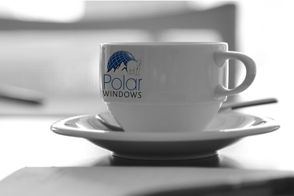
They felt their logo needed updating but didn’t want it to be unrecognisable as their consistent advertising had developed them into a well know, recognisable name. We dissected their existing brand and gave a modern twist to the main elements. Refreshing their look without making them unrecognisable.

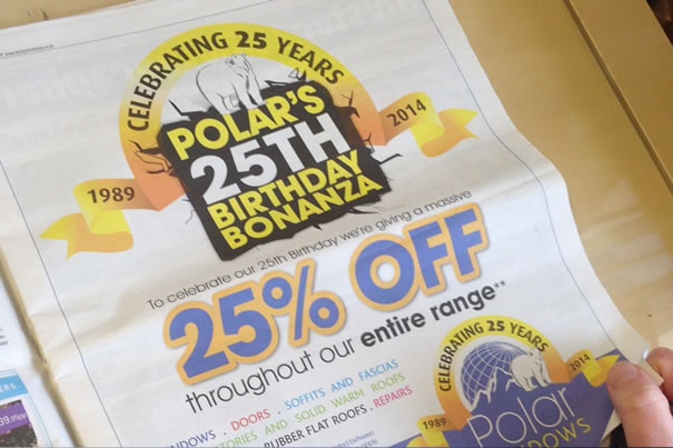
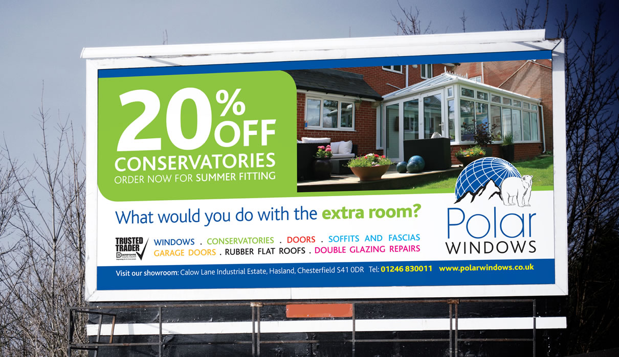
There are many sectors that Polar Windows cover so we decided to allocate a colour to each sector making them a brand in their own right. We rolled this out throughout all advertising for newspapers, leaflets and billboards. The new brand was also developed for their vehicle livery, creating a striking design that worked across various sizes of vehicle. The offers for the various sectors featured on the vehicles as magnetic signs. This enabled Polar to use their vehicles to advertise the different offers easily, hitting a wider audience.

Polar also opened their brand new trade counter; the new logo was used accompanied with a strong solid background to differentiate between the trade and the retail sides of the business.

Polar Windows - Cup
Polar Windows - Advert
Polar Windows - Billboard
no responses
The Hop Pole Pub
06/08/15

The Hop Pole Pub

[rev_slider_vc alias=”thehoppolepub”]

THE HOP POLE PUB

A recommendation pointed the Hop Pole Pub in our direction. They were transforming an old public house that had been closed for many years into an exciting new pub and eating house.

We visited the site prior to the refurbishment being finished and discussed their ideas for the interior and the exciting plans they had for the new bar and restaurant. The concept was to be funky, contemporary with a traditional twist. Bright colours, bold patterns and unusual feature pieces with rustic brickwork, open fires and large Chesterfield Sofa’s.

We wanted the design to reflect the whole concept of the pub so bright bold stripes was mixed with a traditional hop illustration to create the new Hop Pole logo. The colours were carefully selected as they were to run throughout all advertising, menu’s, brochures, website and signage, creating a striking look that is instinctively recognisable.

The Hop Pole Pub - Wall Sign
The Hop Pole Pub - Interior
The Hop Pole Pub - Exterior Sign
no responses
TMAT BLACHFORD LIMITED
06/08/15

TMAT BLACHFORD LIMITED

[rev_slider_vc alias=”tmatblachford”]

TMAT BLACHFORD LIMITED

TMAT, an acoustic solution company, approached us requiring a complete rebrand for the newly taken over business.

They wanted their new brand to be modern, strong and corporate, working across both digital and printed material. The initial plan was to have a corporate brochure, but after much discussion it was decided that a folder and inserts would suit their requirements better as ongoing development meant content changed frequently. Inserts would allow them to update sections of information without the need to reprint an entire brochure.

The new brand was designed around the heart of the business rather than focusing on the products as constant development meant products would frequently change. Icons were designed for each key sector of the company; these were contained within a circle, which then featured in the logo.

The folder was kept very corporate and used special print methods such as spot UV and matt lamination to subtly enhance elements of the new brand. The icons were used for the individual inserts and again enhanced using spot UV to tie in with the folder. TMAT took the branding to a new level when the interior of the building had a makeover and used the new corporate colours for the walls with contrasting wall art of the icons creating stunning feature walls.

TMAT Advert
no responses
Alpha Heating
06/08/15

Alpha Heating

[rev_slider_vc alias=”alphaheating”]

ALPHA HEATING

A long-standing client, Alpha decided it was time to update their corporate look as the business had ventured into new areas.

The logo was to remain untouched so individual icons were developed for all the services they now offered. These feature throughout the new brochure, folder, stationery and advertisements. There are 5 main symbols which appear consistently. The icon in colour represents the topic of the document, the other symbols are faded out but still appear, so a general overview of all they’re services are constantly being advertised. We developed the new style for use on their website, completing the new brand across all media.

Alpha Heating Advert
no responses